Whether you are tasked with creating a single PowerPoint presentation or a series of branded templates for your company, following a few key principles can make the difference between forgettable presentation design and design that leaves a lasting impression.
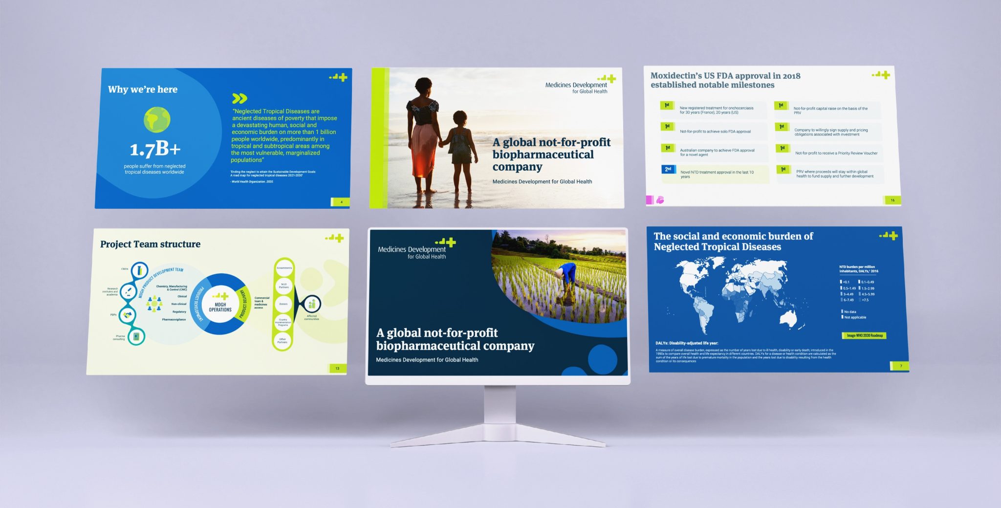
Here’s how you can ensure your presentation design is not only visually appealing but also effective in conveying your message.
1. Stick to Core Design Principles
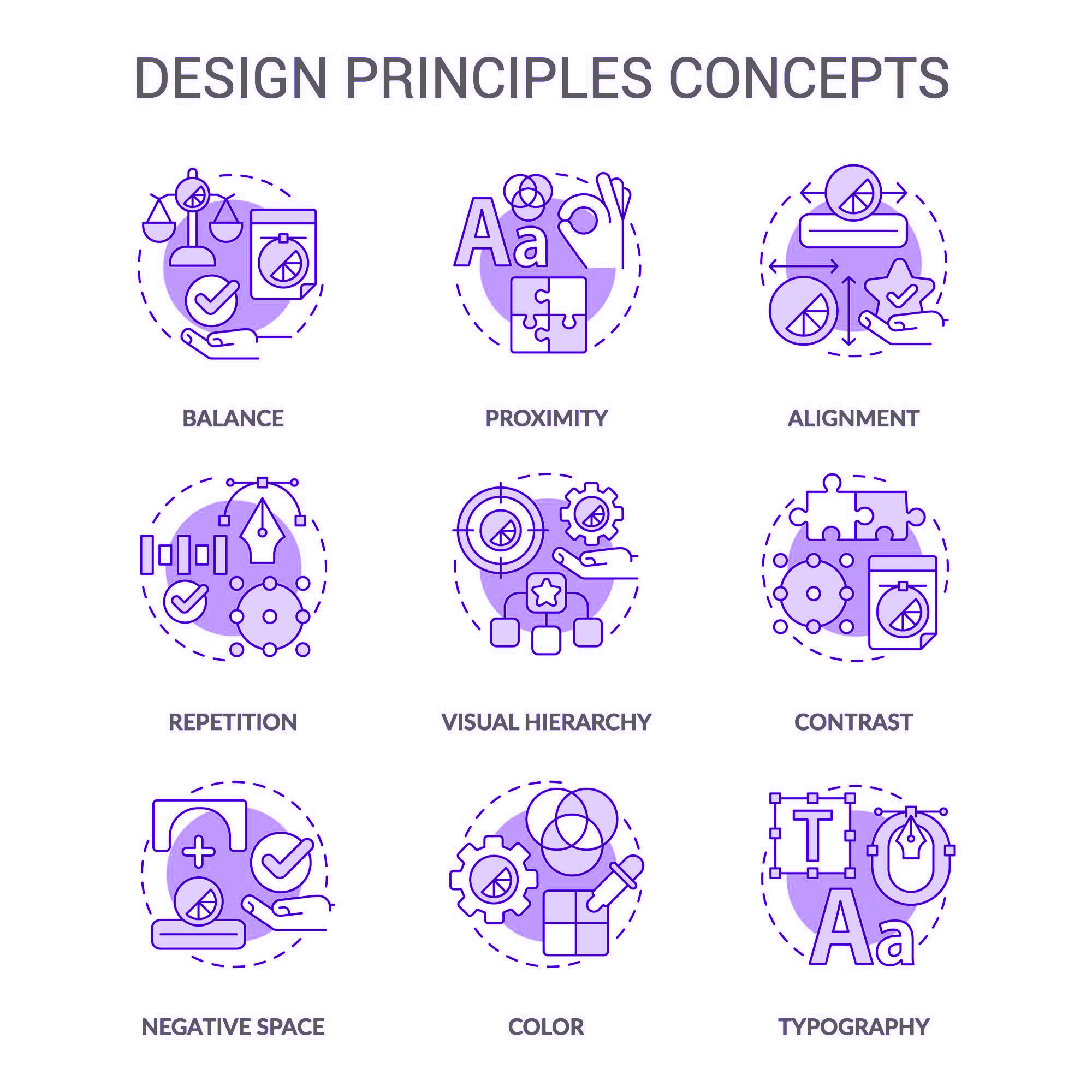
Design principles are not just for graphic designers; they are the backbone of any visually effective project, including PowerPoint presentations. By adhering to these principles, you ensure that your slides are both aesthetically pleasing and easy to follow. Here are the key design principles you should always apply:
- Unity/Harmony: Your slides should feel cohesive, as if they belong together. Use consistent fonts, colours, and spacing throughout the presentation.
- Balance: Distribute elements evenly across your slides. Symmetrical designs are often pleasing to the eye, but don’t be afraid to experiment with asymmetry for a more dynamic look.
- Hierarchy: Guide your audience’s attention to the most important elements first. Use size, boldness, or colour to establish a clear visual hierarchy.
- Proportion: Keep elements in proportion to each other. A tiny image next to a massive block of text can be jarring, so balance is key.
- Emphasis: Highlight the key points you want your audience to remember. Whether through bold text, contrasting colours, or positioning, make sure your main messages stand out.
- Contrast: Utilise contrasting colours or sizes to make important elements pop. This not only draws attention but also enhances readability.
2. Spacing, Spacing, Spacing!
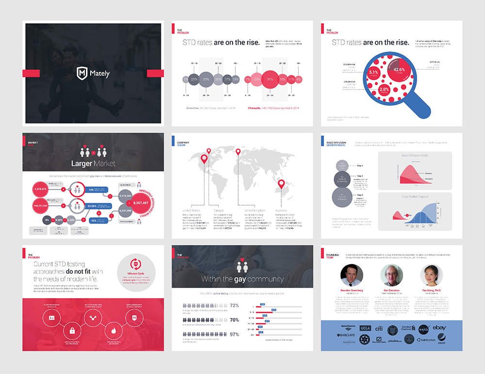
The importance of spacing for effective presentation design cannot be overstated. Adequate spacing helps to declutter your presentation, making it more digestible for your audience. Avoid cramming too much information onto one slide; instead, break up content into smaller, more manageable sections. White space, or negative space, is your friend – it gives your content room to breathe and makes your design appear more polished.
3. Choose an Engaging Colour Scheme
Colour can set the tone of your presentation and influence how your audience perceives your message. Choose a colour scheme that aligns with your brand’s identity or the mood you want to convey. For instance, blue often evokes trust and professionalism, while vibrant colours like orange or red can inject energy and urgency into your slides.
When selecting colours, keep accessibility in mind. Ensure that your text is easily readable against your chosen background colours, and consider using a tool to check for colour contrast ratios. Additionally, try to limit your palette to two or three main colours to maintain visual coherence and avoid overwhelming your audience.
Need help with your colour palettes?
Check out these free online tools that are widely used by graphic designers, creatives, and anyone wanting to generate visually appealing colour palettes quickly and easily:
These website allows users to explore colour schemes, customise palettes, and experiment with different hues to create the perfect colour combination for their projects. This leads to the important topic of accessibility in presentation design, and ensuring your slide decks are AA accessible at a minimum.
4. Ensure Accessibility for All Audiences
Accessibility is a key consideration when it comes to PowerPoint presentation design, as it ensures your content is accessible to everyone, including people with visual impairments. One of the most critical aspects of accessibility is colour contrast, which ensures text is readable against background colours.
To make sure your colour palette meets accessibility standards (see: WCAG guidelines), you can use tools like:
These tools allow you to check the contrast ratio of your colours and ensure that your slides are AA compliant, which is generally sufficient for most organisations. However, to ensure your content is accessible to the broadest possible audience, you can go even further to aim for achieving AAA compliance for your presentation design. This includes stricter criteria for accessibility, such as an even higher level of contrast, better support for low vision users, and more complex accommodations for cognitive disabilities.
By ensuring your presentation design is accessible, you’re not only complying with best practices but also making sure your message reaches the widest possible audience.
5. Keep It Simple
One of the most common mistakes in PowerPoint design is overcrowding slides with information. This often includes overly complex graphs and charts that can confuse rather than clarify. Ask yourself whether these elements are truly necessary to convey your point. If not, consider simplifying or omitting them altogether. Remember, the goal is to make your presentation as clear and engaging as possible.
If you do need to include data, try to simplify charts by focusing on the key takeaways. Use clean, straightforward visuals that your audience can grasp at a glance. Additionally, we recommend using animations sparingly to avoid distraction and ensure that they serve a purpose, such as highlighting a critical point.
Consider multiple use cases:
It’s essential to keep in mind that your presentation is unlikely to only be viewed in presentation mode; it may also be shared as a PDF or other document format via email. When designing, consider how the presentation will be consumed in different formats. This is especially relevant when it comes to text-heavy slides.
For example, while bullet points might work well during a live presentation, they may lack context when viewed as a PDF without the accompanying talk track. In these cases, it may be better to use short, complete sentences instead of bullet points to ensure clarity, no matter the format.
By considering the various ways your PowerPoint presentation might be used, you can create a more versatile and effective design that works across multiple mediums.
6. Don’t Settle for Default Fonts: Weighing Microsoft Fonts vs. Premium Fonts
Fonts play a crucial role in setting the tone and enhancing readability in your presentation. While default Microsoft fonts like Calibri, Arial, and Times New Roman are functional and widely used, they can make your presentation look generic. However, there are pros and cons to consider when choosing between standard Microsoft fonts and premium/paid fonts.
Microsoft Fonts – Pros:
- Microsoft fonts are included on all devices, ensuring consistency and preventing the risk of fonts dropping out or being substituted.
- They’re easy to use, especially for large teams where not everyone may be familiar with font embedding.
Premium Fonts – Pros:
- Premium fonts can be embedded to maintain consistency with your brand’s identity, giving your presentations a professional, polished look.
- They offer unique options that help your presentation stand out and align closely with your company’s branding guidelines.
Our recommendation:
We generally recommend using premium fonts if your brand doesn’t have a strong Microsoft alternative, as maintaining consistency across your marketing collateral should be a high priority. However, if you have a large team or if it’s difficult to train all staff on how to ensure fonts remain embedded when using your company’s PowerPoint template, opting for Microsoft fonts may be the more practical solution.
For those interested in embedding fonts, there are several online guides available. Here’s a useful resource on how to embed fonts in Microsoft PowerPoint.
7. Elevate Your Presentation Design with Illustrations
Illustrations can take your presentation to the next level by making it more interesting and engaging for your audience. They draw attention and, when used correctly, add a styled element that can be repeated throughout to create a sense of unity across your slides.
If your company or organisation already has a distinct illustrative style in use as part of your branding, it’s best to utilise what’s available in your asset library. Alternatively, consider hiring a professional graphic designer or illustrator to create something custom that aligns with your brand and enhances your deck.
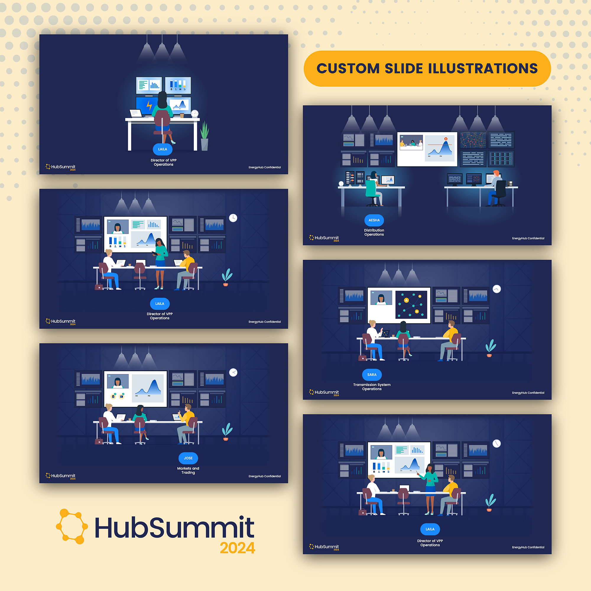
For those looking for quick options, there are plenty of excellent illustrations available for purchase on stock websites like iStock and Shutterstock, where you can find illustrations in various styles to match your presentation’s theme.
Conclusion: Impress Your Whole Team with Professional Presentation Design
A well-designed PowerPoint presentation not only captures your audience’s attention but also boosts your confidence as a presenter. By adhering to key design principles – such as prioritising spacing, selecting an engaging colour scheme, keeping it simple, and choosing the right fonts – you can create presentations that leave a lasting impression.
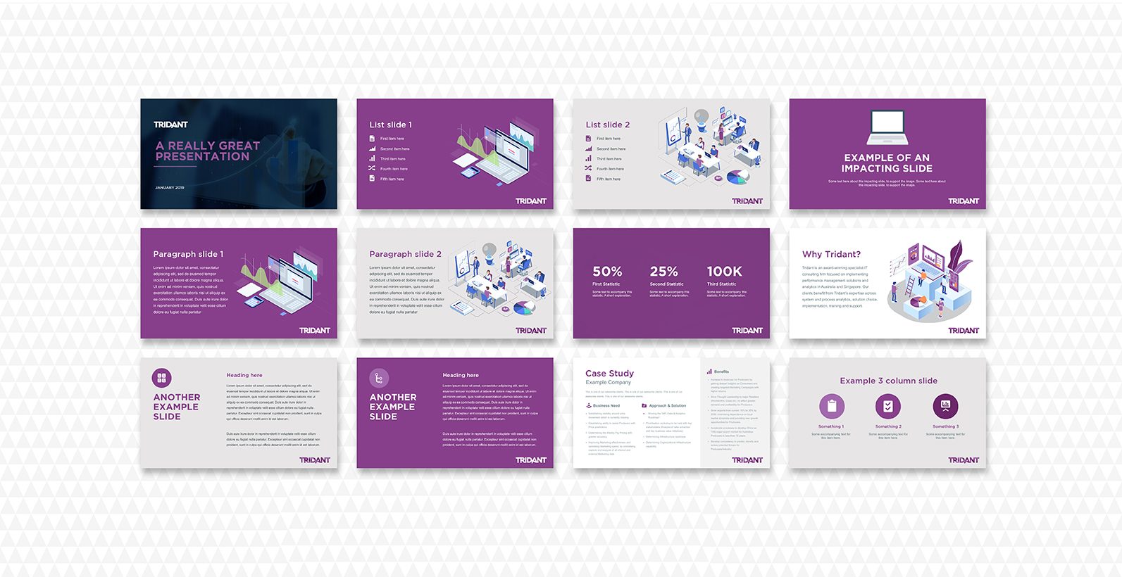
Is your team short on time or would you prefer to work with an expert?
At Ethical Design Co., we specialise in creating powerful, visually compelling PowerPoint presentations tailored to your brand and specific needs. Whether you need a single presentation or a series of branded PowerPoint templates, our experienced designers can help ensure that every slide not only looks amazing but also effectively communicates your message.
We work with various budgets, so it doesn’t have to cost a fortune. Some design is always better than no design. Simply provide us with your budget, and we’ll polish your presentation to match that value.
Explore our presentation design services to discover how we can elevate your presentations to the next level.
If you need help designing professional, branded PowerPoint templates for your company:
Let us take the stress out of designing your next presentation! With our expertise, you can present with confidence, knowing your slides are working as hard as you are to deliver your message.

