Unlike business and company websites, nonprofit websites are generally more focussed on gaining campaign traction and attempting to encourage financial and other support.
Designers and developers who are responsible for designing and managing a nonprofit or charity website must focus a lot more on this specific purpose of the user experience (UX). Their design solutions need to ensure that:
- Visitors understand exactly which campaigns are running and why
- Visitors are encouraged to make financial donations or support in other ways
- The website is highly informative and transparent and well organised
- The message and vision of the organisation’s brand feels established and strong
- The website fosters a sense of connection and community
The following list showcases 6 websites that I feel have cleverly and beautifully addressed each of these points. With my own experience in community development I have made sure to only showcase websites of organisations that I know to be wonderful at what they do:
6. Greenpeace Australia
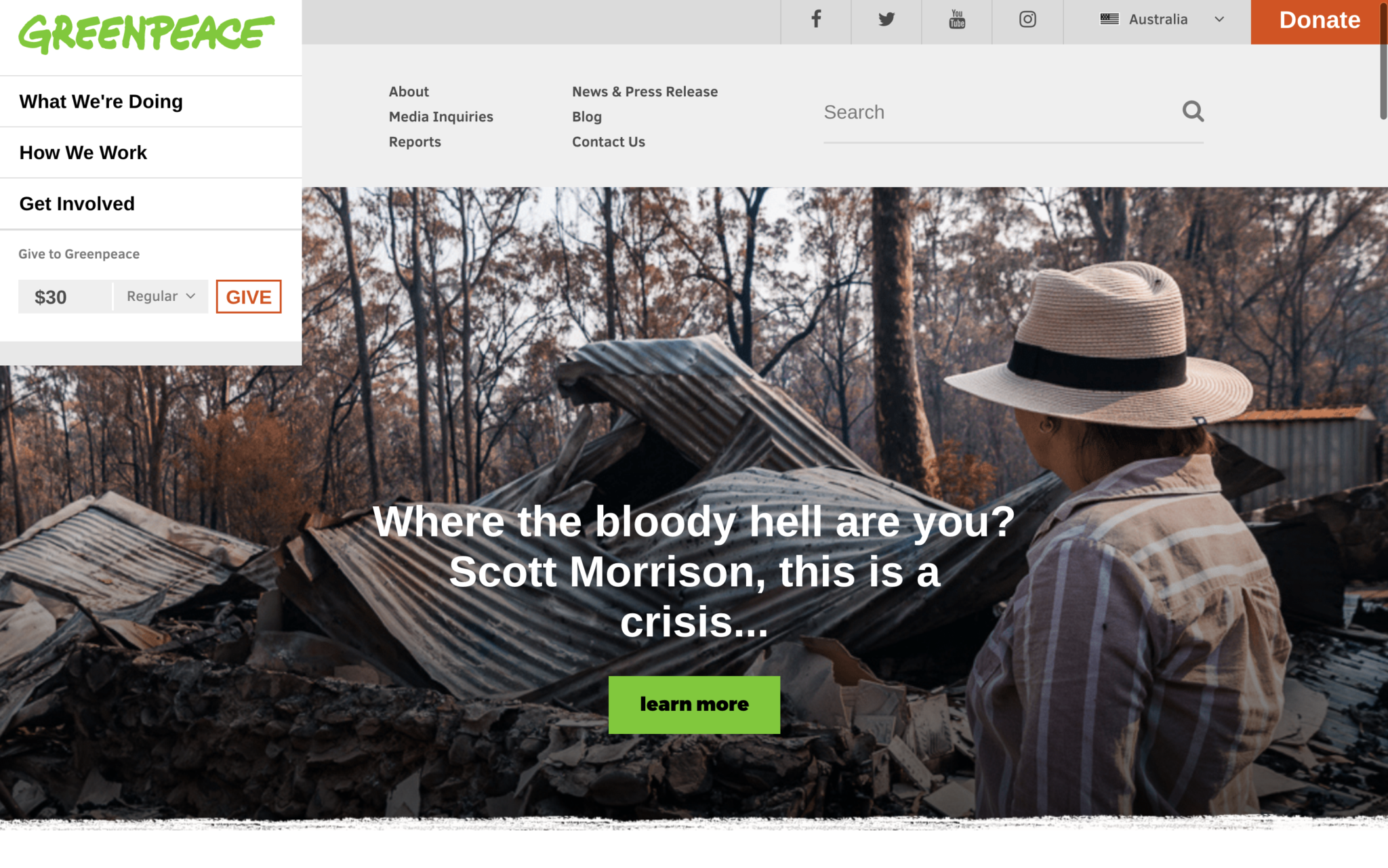
Greenpeace Australia Pacific is the Australia-Pacific arm of Greenpeace International – the leading independent campaigning organisation fighting for a green and peaceful future through direct, non-violent, action.
Two environmental activists founded Greenpeace in Vancouver, Canada in 1971; today they have offices in over 39 countries. Greenpeace advocates action-focused campaigning on issues such as climate change, renewable energy for all, deforestation, anti-nuclear arms, overfishing, and commercial whaling, through direct action, lobbying, research and ecotage.
What I love about this nonprofit website design
- Nice use of negative space throughout.
- Excellent use of hierarchy: they’ve used a separate navigation menu to make the most important pages stand and help direct the visitor.
- Good selection of images, graphics and other content to make the website bright and engaging.
- Call-to-actions are well placed in the design to encourage user engagement.
- The repeat placement of social media icons on the homepage to push users to their social communities and remind visitors to share links to petitions and important campaign content on their social media channels. Repetition is good for motivating user engagement.
- As an action-focused organisation, the main aim of Greenpeace’s site is to make it easy for people to participate in their campaigns and join the green movement – this is achieved well. It might not be as ‘pretty’ as some of the other charity websites listed here but sometimes beauty alone doesn’t always equate to action.
Website: greenpeace.org.au
5. Amnesty International
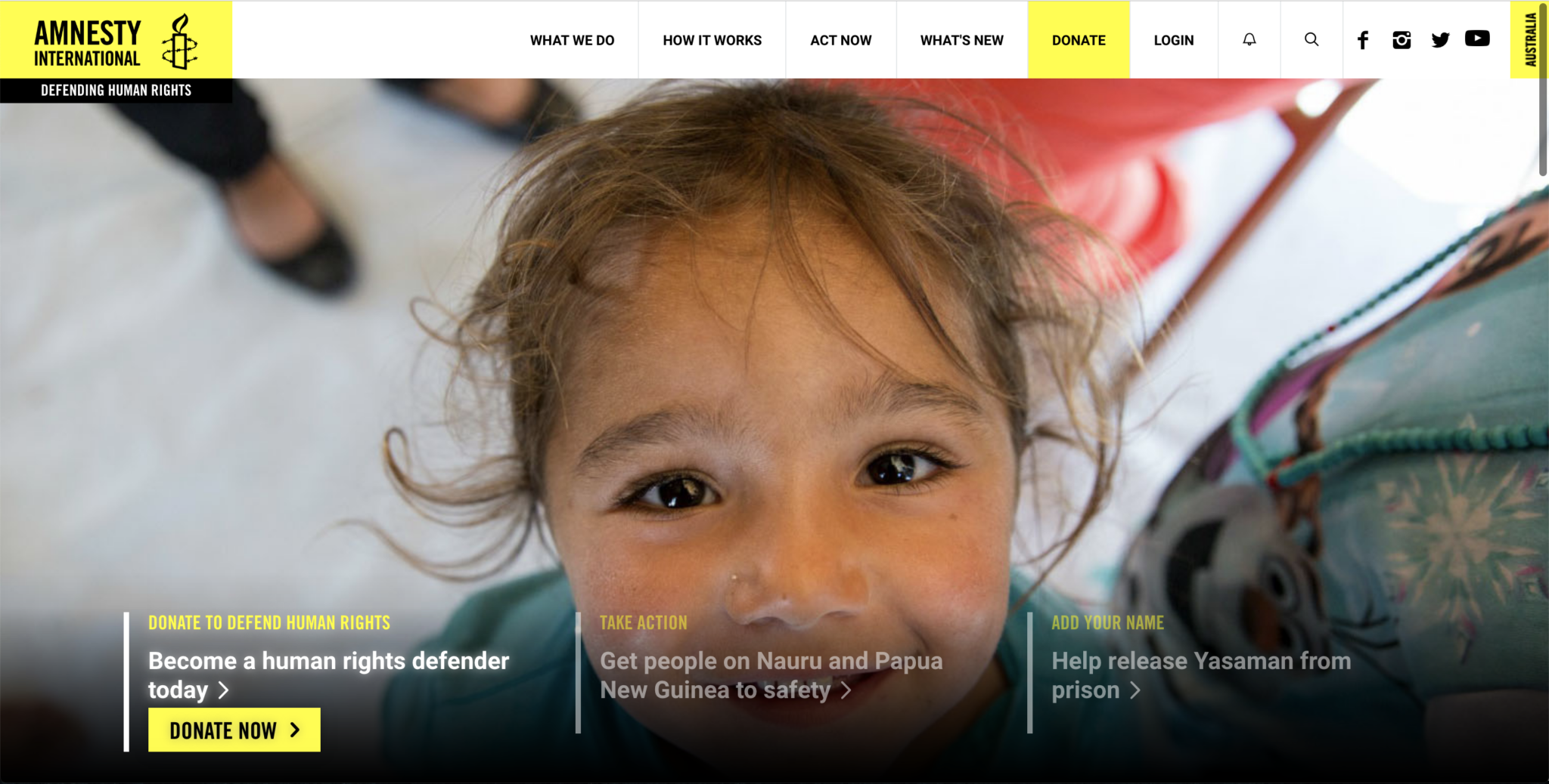
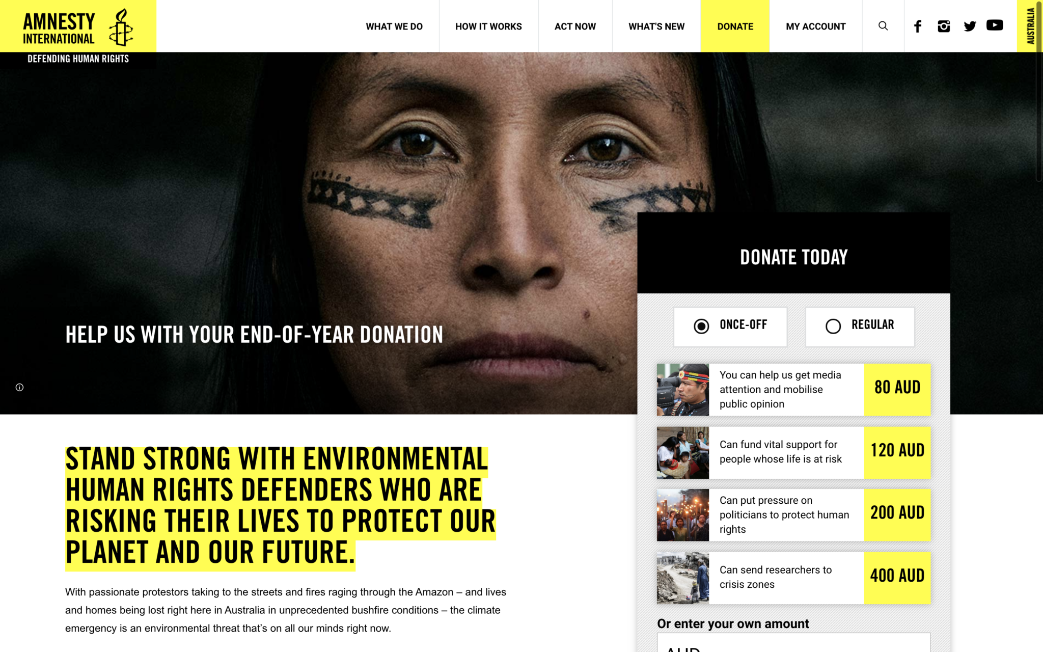
Amnesty International (Australia) is the Australian branch of a non-governmental organisation focused on raising awareness and funds to fight abuses of human rights worldwide. Amnesty International was founded in London in 1961. The global movement to protect and defend human rights of individuals at risk has over 7 million members and supporters.
What I love about this nonprofit website design
- Clean and minimal design but with loads of useful information, resources, videos and effective calls-to-action.
- Colour scheme is black and white with one bright colour (yellow) which is both eye catching and a good design strategy. Using just one or two primary brand colours with an otherwise greyscale palette creates a sense of unity which is important for brand recognition.
- Good amount of text on the pages to engage viewers but not to overwhelm with information overload.
- Effective use of supernav menu for great organisation of pages
- The large bold headings and entry sentence text are eye catching and encourage the viewer to read the campaign information or news stories. This is important considering one of Amnesty’s main organisational objectives is to raise awareness over human rights issues.
- Appropriately placed call-to-actions, including the stand-out ‘Donate Today’ box on the Donate page that is effective in immediately grabbing the visitors’ attention and encouraging donations.
- Beautiful use of photography throughout the site, especially the striking header photos.
- Bold and impacting typography. Although I’m not a huge fan of using all-caps for headings (I feel it’s a little dated), I think it works well in this context.
- Translates well to mobile.
Website: amnesty.org.au
4. Charity: Water
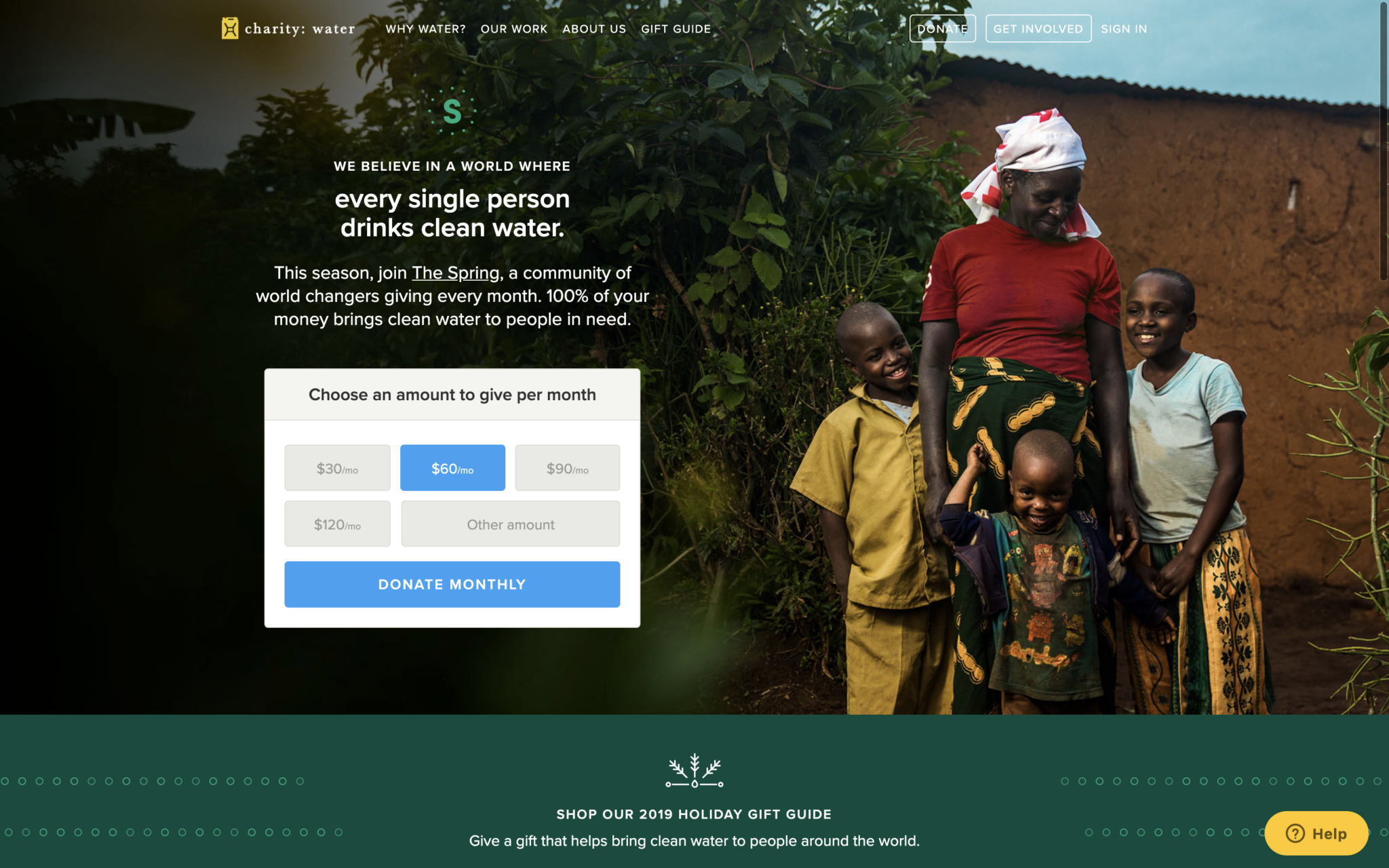
Charity: Water is a nonprofit organisation working to bring clean and safe drinking water to people in developing countries. Charity: water was founded in New York in 2006.
What I love about this nonprofit website design
- The colour scheme is on point for a charity website: bright and welcoming. This site is up there as one of my favourite charity websites for the choice of colours.
- Images are beautiful and vibrant. They cover edge-to-edge screen space which is not only visually appealing but also helps break up the pages into distinct sections.
- Well placed call-to-actions.
- Well organised content: simple and clean top navigation bar and a footer that is ordered into four relevant sections..
- Overall, the site utilises a clean and organised visual design and UX, it’s fast and responsive and looks great on both desktop and mobile.
Website: charitywater.org
3. WWF-Australia
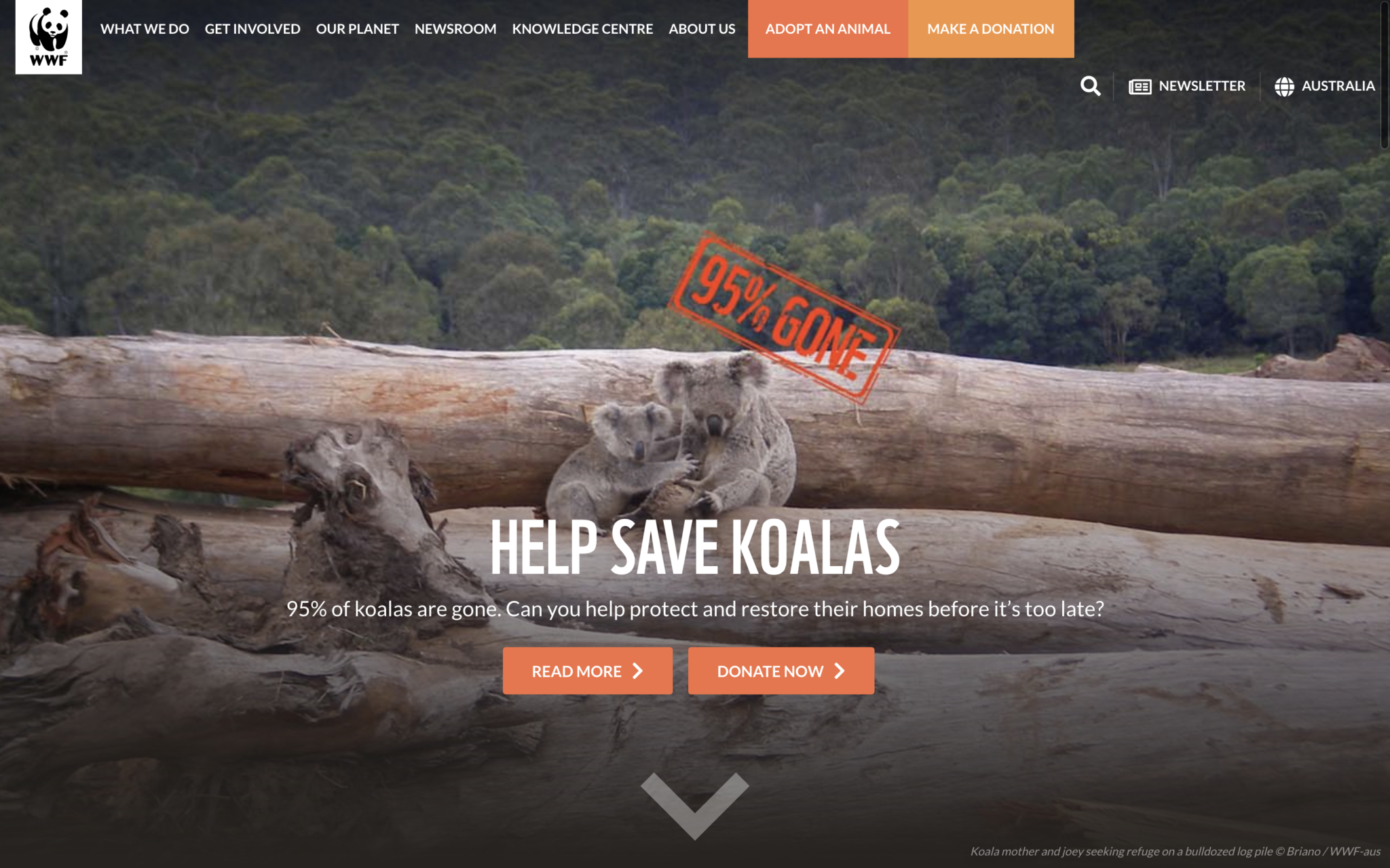
WWF-Australia is part of the WWF (World Wildlife Fund for Nature) International Network, the world’s leading, independent conservation organisation. WWF works on wilderness preservation and the reduction of human impact on the environment (and the planet’s natural resource). WWF was founded in Switzerland in 1961.
What I love about this nonprofit website design
- Pages and pages of valuable information on environmental and wilderness conservation. This nonprofit website is a really great resource for anyone wanting to know more about the increasingly important issues facing our planet and wildlife today.
- The use of different colours for important buttons within the top navigation bar.
- When you hover your mouse pointer over the navigation bar, the menu items change to white on orange, and when you hover over the individual sub headings the text turns black. These transitions create a clean UX and are enticing to the viewer. I found myself wanting to click on all of the sub headings to check out what the pages had to offer.
- The colour scheme is black, white + one colour (orange), and as per the Amnesty website: simple colour schemes are generally more attractive than lots of colours which can look a bit busy.
- The homepage call-to-action buttons are well-positioned in the middle of the screen.
- The use of evocative and emotional photography.
- The site is mobile-friendly and retains the bold look and feel across different screen sizes.
Website: worldwildlife.org
2. Acumen
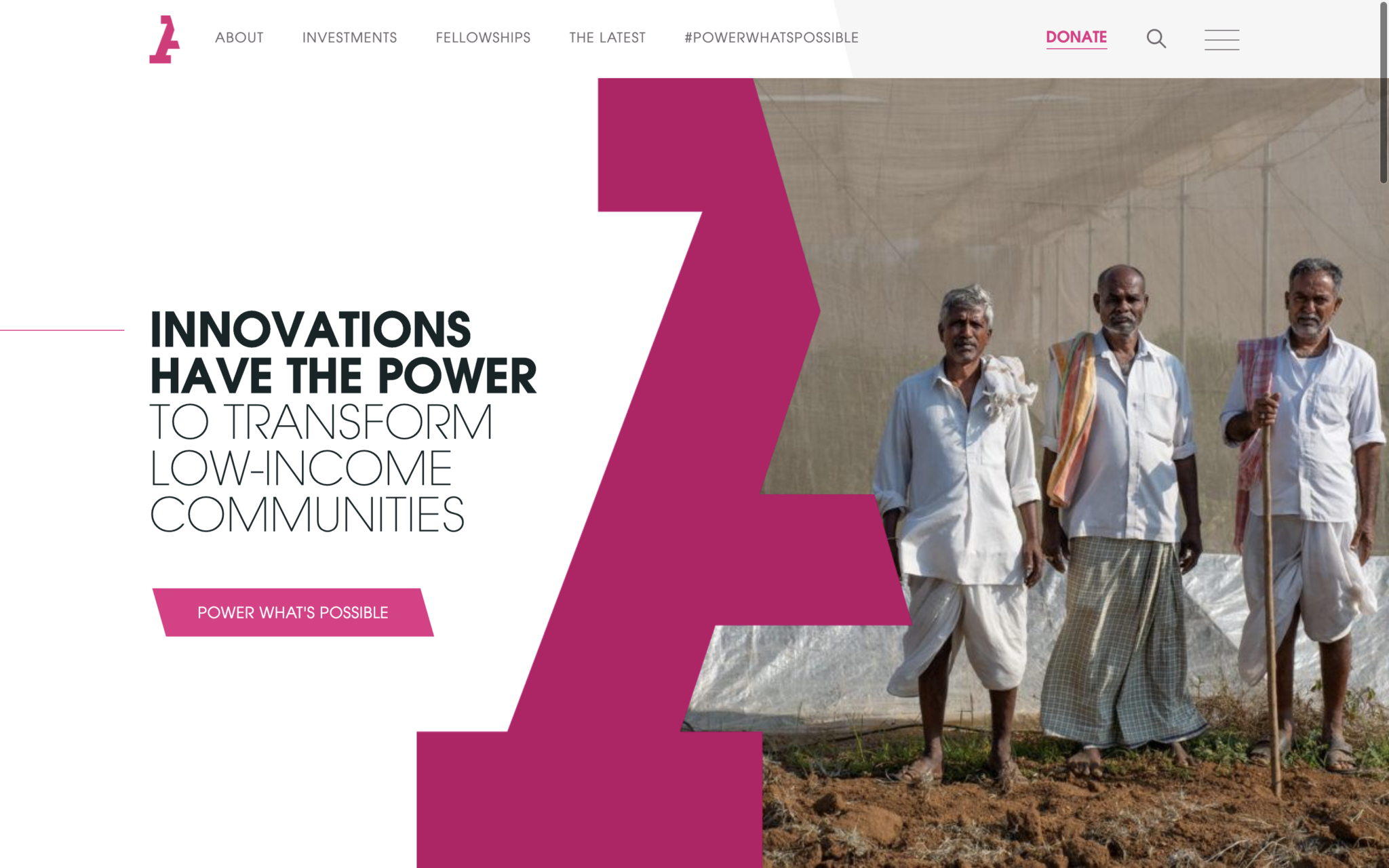
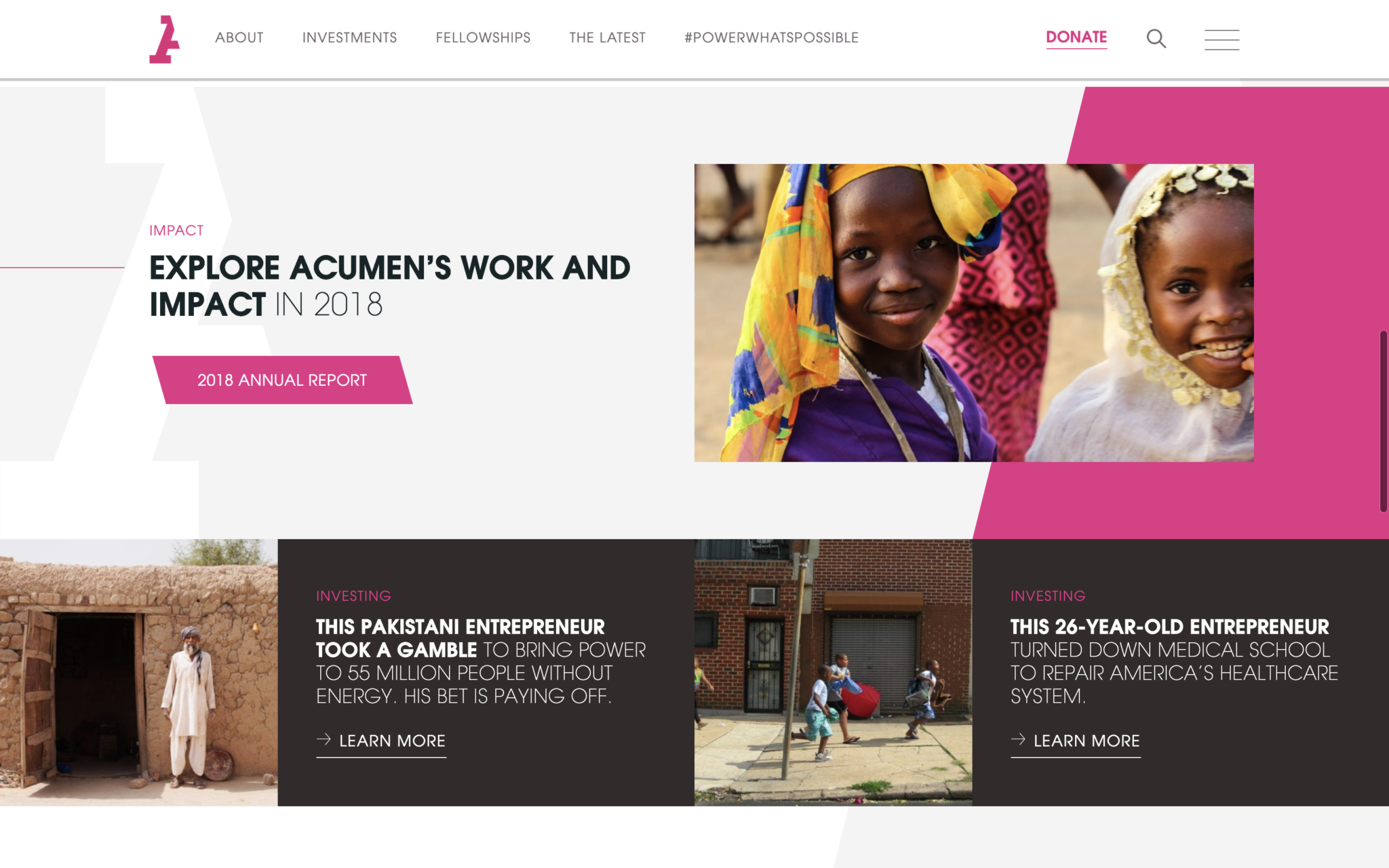
Acumen is a global nonprofit (impact investment fund) changing the way the world tackles poverty by investing in sustainable businesses, leaders, and ideas.
Acumen have been investing in social enterprises that serve impoverished communities in developing countries across Sub-Saharan Africa, South Asia, Latin America, and the United States, since its founding in 2001.
What I love about this nonprofit website design
- It’s very beautiful to look at and clean to use.
- The first thing I noticed about Acumen was their magenta logo. Love it! They have used their branding and graphic devices well throughout their website; including isolating the slant of the logomark and repeating it across the site to create a strong impression.
- The complexity of what Acumen does as an organisation (that is, investing millions into low income communities in order to create lasting and bottom up change in worldwide economies) is so simply and elegantly displayed on their site.
- Great UX features; from an easily navigable menu, perfectly placed call-to-actions and engaging impact pages (in terms of amounts of text vs. images vs. placement of both)
Website: Acumen.org
MY TOP PICK FOR 2019
1. Upstream
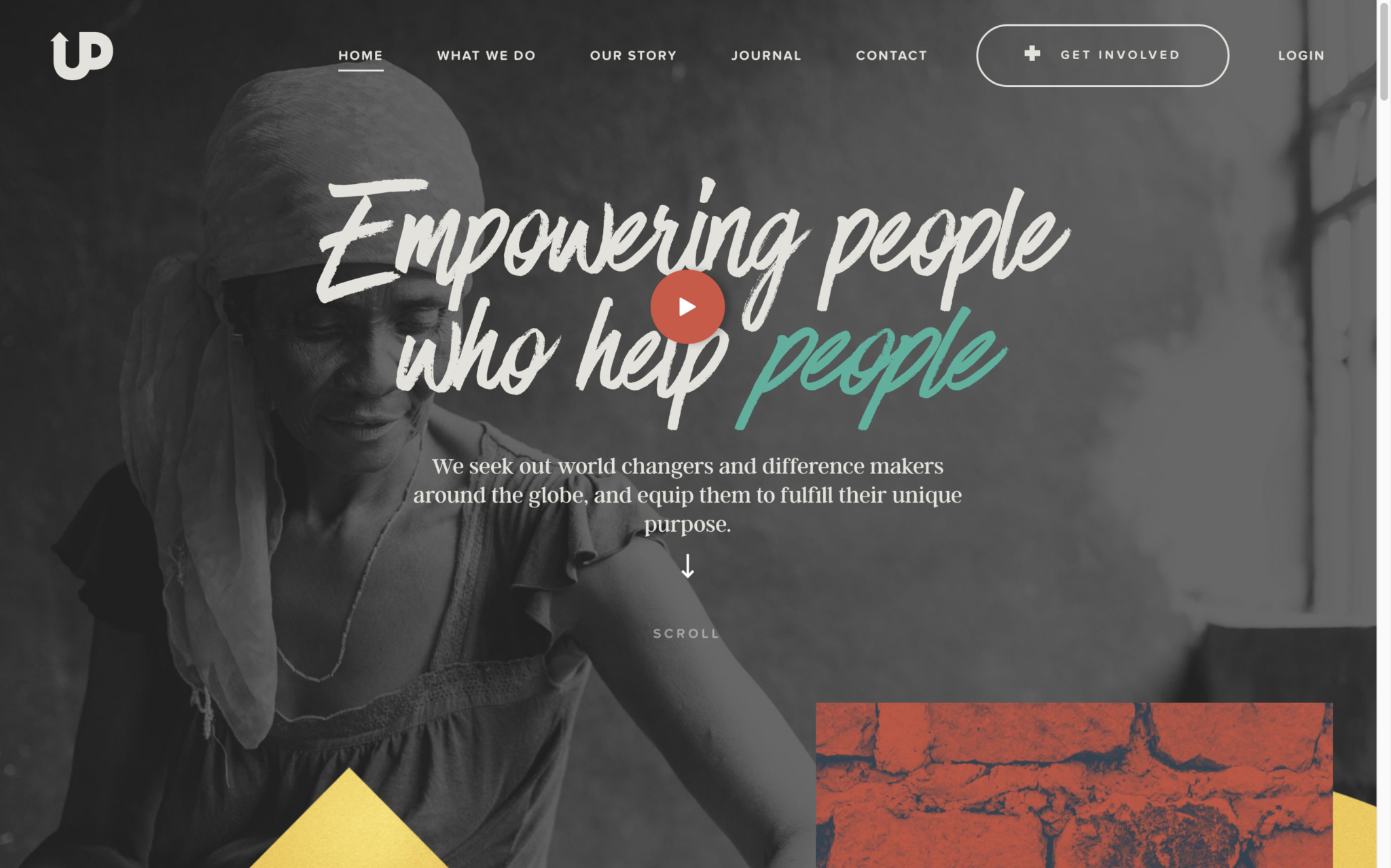
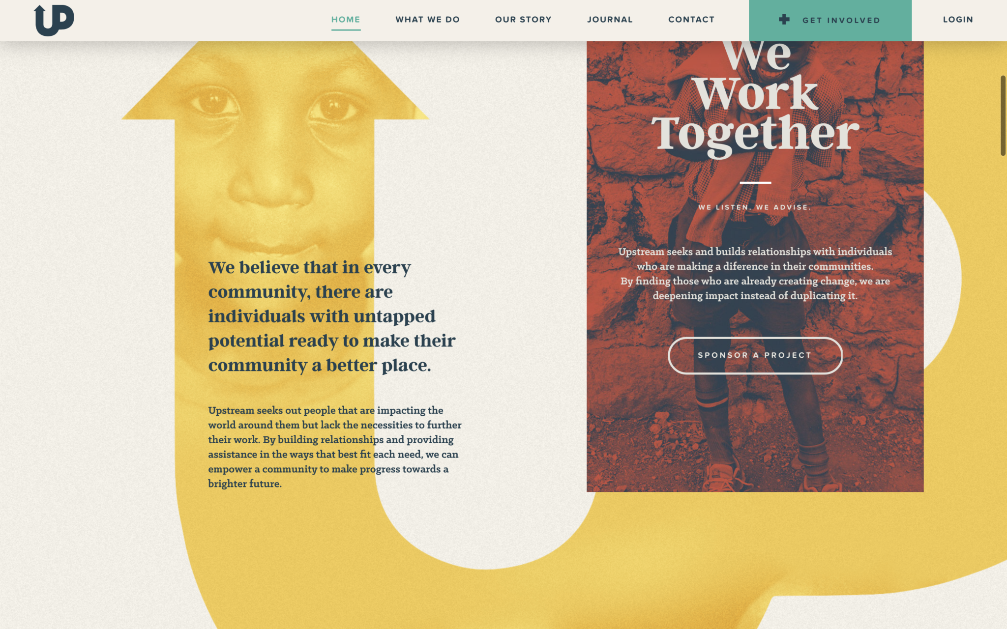
I came across Upstream’s site when I was researching a comms branding project we worked on this year: E.thical – the new educational program arm of For Good; empowering youth and university students in marginalised areas of Indonesia through sustainability-focused entrepreneurship.
Upstream International is a global nonprofit Christian organisation that works to bring people together to challenge poverty in creative ways. Founded in 2012, Upstream works to empower local changemakers and communities with the resources they need to grow independently and sustainably in order to create larger, longer-lasting change.
With the support of donors Upsteam is able to build schools, provide educational materials, create sustainable food programs and provide hope to individuals and communities in need (namely in Haiti, Uganda and Kenya).
The missionary organisation was founded in 2012 by former pastor Joe Rigelsky along with his wife Sami Rigelsky and their 8 children. The entire family was based in Haiti for a year during its inception.
What I love about this nonprofit website design
- Upstream has a strong logo and identity branding that is consistent across their award winning website. Much like Acumen’s web design, Upstream has incorporated the logo into the design of the homepage in a striking and effective way.
- The design approach can be described in one word: bold.
- The combination of a warm and welcoming colour scheme, a unique and functional layout, and powerful imagery used throughout engages and excites the visitor enough to scroll on further.
- The choice of real life images that evoke feelings of joy, hard word and empowerment in some of the most poverty-stricken areas in the world should be commended too.
- The homepage is expertly designed to tell Upstream’s story and build trust with the visitor, inspiring them to join their cause.
- The use of beautiful scroll transitions and button animations. The more you scroll, the more interactive the site becomes.
- The decision to donate to a charity or sponsor a child is a personal and emotional decision. The choice of layout, animations, and colours all intentionally serve to build a deep connection to the viewer. The tone of the text throughout aids this connection too.
- As expected, the vibrant and user-friendly desktop experience translates superbly to handheld devices, and the ability to make Upstream donations is quick and effortless
Website: upstreamint.org
That’s it for 2019! With web design trends changing rapidly and a greater understanding of the ideal user experience leading designers more and more, let’s see what sort of the world of nonprofit website design brings in the next decade.
Caitlin, I don’t know why I am just seeing this, but thank you so much for choosing Upstream as your favorite website. Also thank you for your kind words.
Joe Rigelsky